
Get your messaging hierarchy right
Emphasis, by definition, has to be somewhere. It cannot be everywhere.
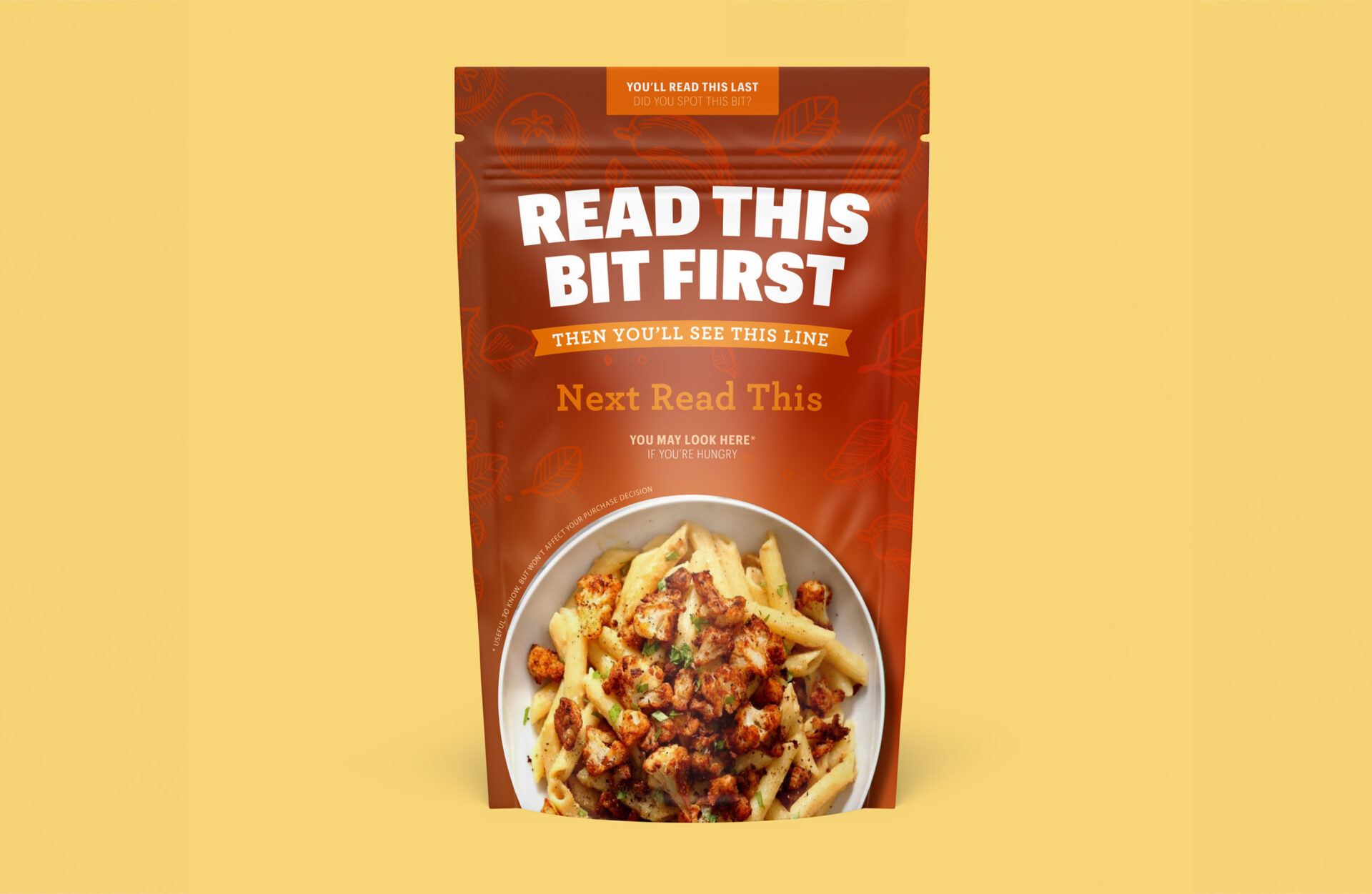
This image is a food packaging mock-up, designed to illustrate the importance of hierarchy. It’s an example of how design can guide people’s attention; you might need to zoom-in to read the text.
Your product is competing for attention, whether you’re selling direct to consumer or through retail stores on the high street. Packaging needs to resonate with your target audience, but that’s not just about deliciously appetising photography. The design needs to work, so don’t try to say everything on the front of pack.
What’s most important to your customers? It might be the brand name, it could be the product type or a brand new innovation. Whatever it is, you have a split second to get their attention, so it’s crucial to get the hierarchy of information right.
Emphasis. It has to be somewhere.
Get in touch to talk about your brand packaging.


