


Make your food brand packaging pop!
Colour is a powerful tool for brand builders. You can even use colour to convey to the brain what taste is to be expected.
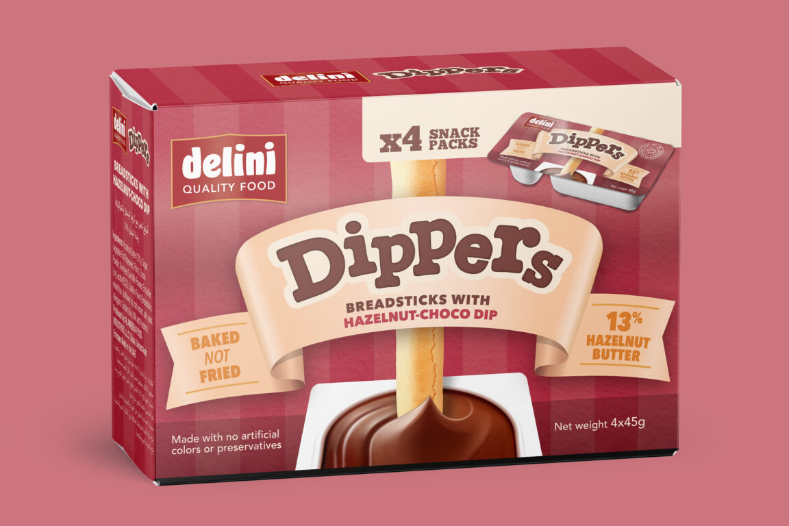
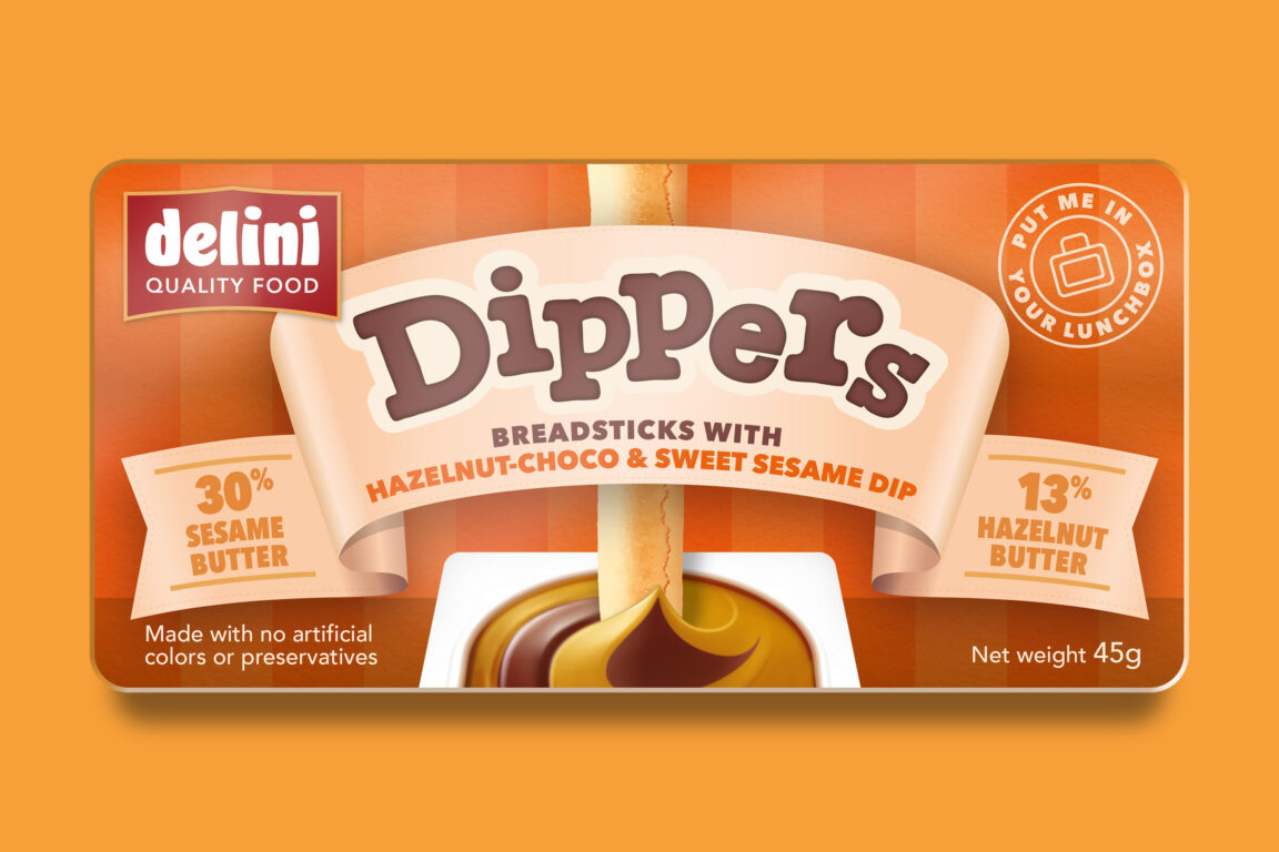
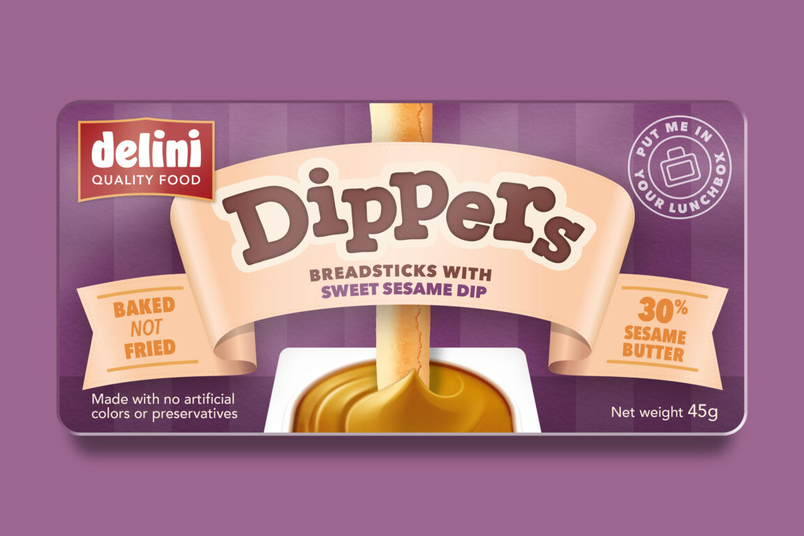
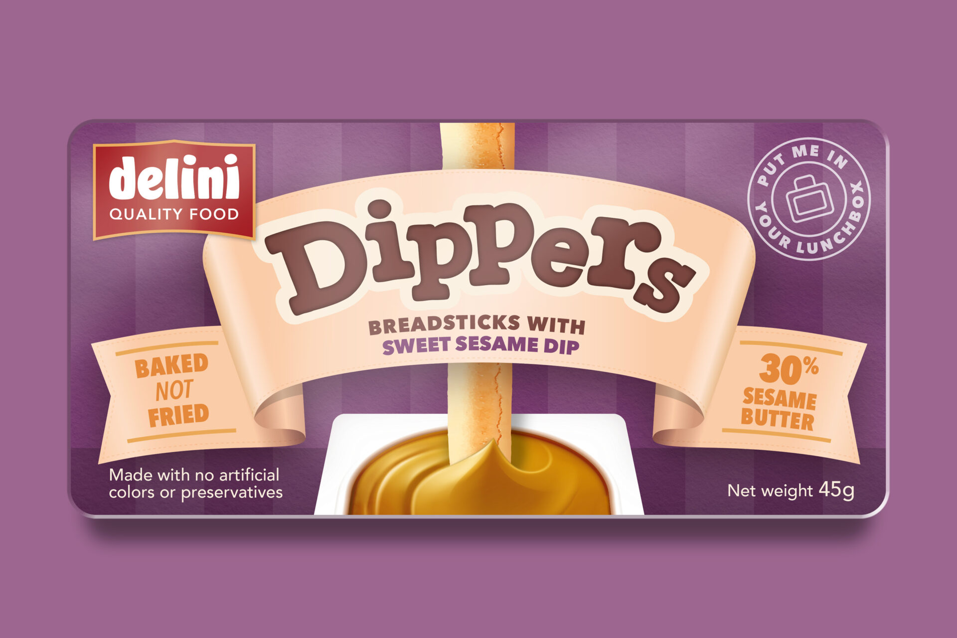
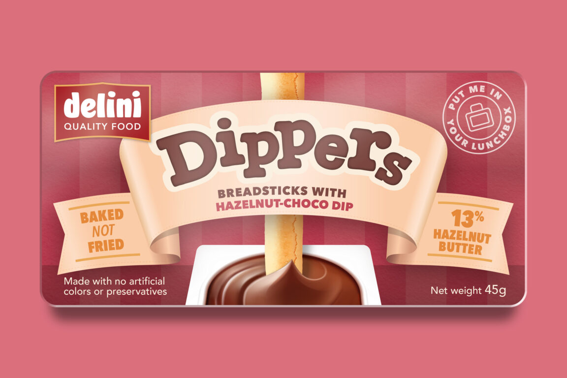
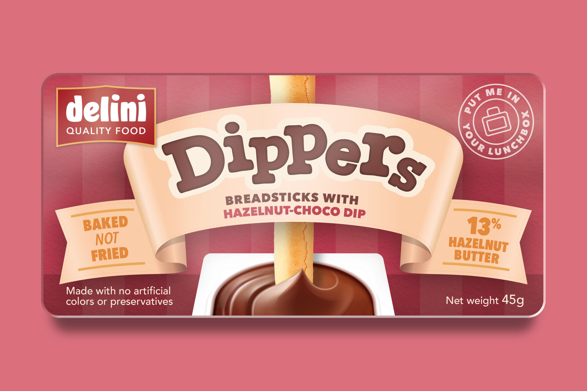
This is a brand identity and packaging design that we created for the Delini Dippers snack brand, launching in the Middle East. This is an example of how you can use colour in your packaging to distinguish between different flavours in the same product range.

Here are some things to think about when using colour to differentiate your product range:
1. Understand your audience
Research your target audience’s preferences, emotions, and cultural associations with colours to choose a palette that will resonate with them.
2. Consistent branding
Assign specific colours to different product categories or lines. Consistency in colour usage across your branding materials, packaging, website, and products helps build recognition.
3. Colour psychology
Understand the psychological impact of colours. Colour can convey to the brain what taste is to be expected. Use colour to reflect different flavours and ingredients in your brand packaging, choosing colours that align with the emotions you wish to evoke.
4. Contrast and hierarchy
Use colour to create contrast between products in the range, making it easier for customers to distinguish between different options. You can also use colour to establish a hierarchy, emphasising premium or popular items.
5. Colour-coded naming or packaging
Consider using colour-coded labels, packaging, or product names to help customers quickly identify different variations of your products.
6. Colour themes
Create distinct colour themes for each product line or category. This can be extended to your marketing materials, social media, and even your physical store or online platform.
7. Accessibility
Try to ensure your range of colours is accessible to a wide range of users, including those who might have colour vision deficiencies.
8. Testing and feedback
Before finalising your colour choices, gather feedback from a diverse group of individuals to ensure your selections are well-received and effective.
9. Competitor analysis
Research your competitors’ colour choices to make sure you’re setting yourself apart, while also staying relevant within your category.
10. Evolution and adaptation
As your product range and business grow, be open to adapting your colour strategy to stay aligned with changing trends and customer preferences.
Remember, the goal is to make your products easily recognisable, convey your brand’s identity, and resonate with your target audience. Food and drink packaging design needs to perform in one of the harshest competitive environments. Colour is one of the consideration when it comes to shelf stand-out, whether you’re selling online or through the supermarkets.
In such a competitive market, effective packaging design will help you to make an impact and boost sales. Get in touch to discuss your brand packaging.