
Principles for packaging that sells
Food and drink packaging needs to work in two ways. The primary function is to protect your product, but the principle aim is to attract more customers. In a retail environment, but also for direct-to-consumer (DTC) brands, packaging design can be the most potent weapon in your marketing toolbox. Your product packaging needs to be effective and optimised for the point of purchase, which is why brand marketers are increasingly investing more time and energy in their pack design.
Assess your packaging performance
The challenge is to convey your key messages in a way that will convince people to buy your product, rather than something else. The on-pack messaging needs to come across instantly, so it’s critical to give the consumer only what they need to know. Shoppers will typically evaluate their choices in three stages, something we refer to as the ‘10-3-1 principle’.
10-3-1 principle
What does a shopper see from 10 metres, 3 metres and 1 metre away from your product?


10 metres
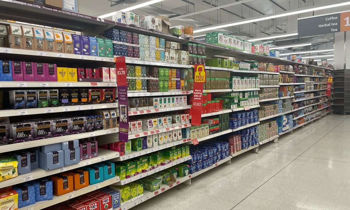
Shoppers begin the navigation process by seeking out the type of product they’re looking for. From a distance of 10 metres, the first thing we notice is familiar colour combinations, packaging shapes, possibly some imagery or symbols. Branding is the visual cue that narrows the search process, so the overall design composition plays an important role in getting your brand noticed.


3 metres
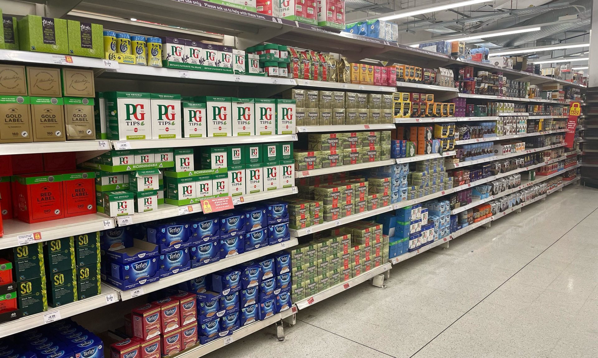
From a distance of 3 metres, shoppers will stop and scan the shelves; they’ve located the correct aisle and product category, now they’re looking for the variety they want. This is typically where we spend the most time evaluating our options, so it’s essential that your packaging conveys the right messages at this stage.


1 metre
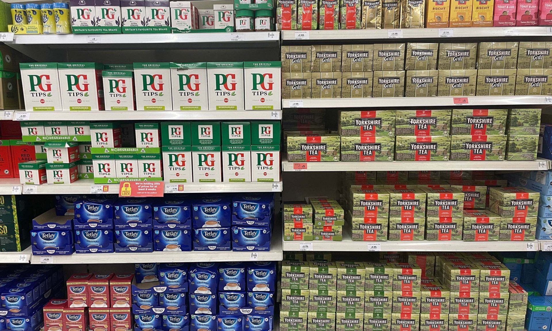
At close range shoppers are presented with a narrow selection of different products, all competing for their attention. This is your opportunity to convince someone to buy your product rather than something else, whether they’ve heard of you before or not. To get your product picked-up, you need to create stand-out and differentiation with strong product visuals, also making sure that any health claims or proof points are concisely worded (but visible).
Get the hierarchy right
Many brands struggle with the hierarchy of information, which is extremely important when it comes to effective pack design. Emphasis, by definition, has to be somewhere. It cannot be everywhere. We often encounter brands trying to say everything on the front of pack, which leads to visual clutter and a lack of clarity. This can make your packaging less effective. Ask yourself what consumers care about most in your category, then make sure those messages are displayed with prominence. To retain clarity of message, you might need to relegate any supplementary content to the back of pack or side panels.
The retail landscape is a battlefield where other brands are trying to steal your market share. There is fierce competition between new brands, established brands and own-label products, so your pack design must stand up to scrutiny and be ready to perform. Getting the hierarchy right means customers will see what they need to know at the right moment, encouraging them to notice your product, pick it up and put it in their basket. Next time you’re in the supermarket, do the squint test: blur your vision and scan the shelves. What stands out first?
Make your design more effective
Food and drink packaging has to perform in one of the harshest competitive environments. Those visual cues apply to both in-store and online retail, whether you’re selling DTC or through the big online supermarkets. Ocado’s range now spans more than 50,000 products, with some clever algorithms presenting shoppers with an abundance of thumbnail images to choose from. With that in mind, your packaging design must demand more of your attention if you’re going to compete.
Packaging is the last message a consumer sees, and that’s your last chance to convince them to buy your product over something else. Get in touch to discuss your packaging performance and optimise for sales.


