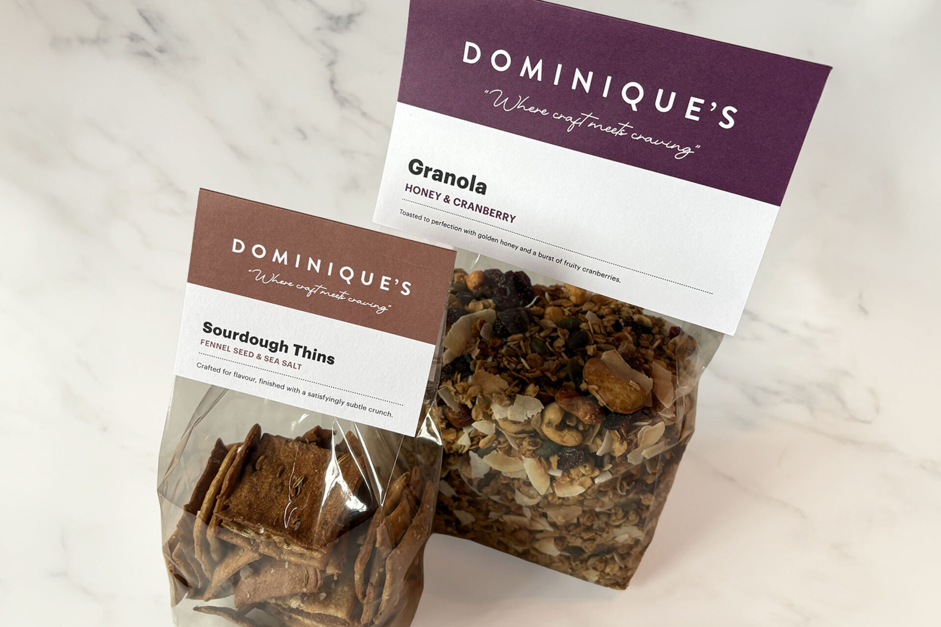

Simplicity is the new ‘super greens’ for food brands
In the age of information overload, complexity doesn’t win attention — clarity does. For food and drink brands, that means stripping back the non-essentials, honing in on the truth of your product, and letting design and story amplify that truth. At TFBG we’ve seen time and again how simplicity becomes a strategic asset — one that endures beyond the latest trend.
Here’s what you should know — and action you can take.
The Shift Toward Simplicity
Walk down any grocery aisle today and you’ll see packaging filled with badges, claims, ribbons of typography, multiple colours, selfies of founders, farm imagery, QR codes, more badges — it goes on. It was once the way to demonstrate premium, to tell your story, to justify price. But now it’s easy to get lost in the noise.
Consumers aren’t necessarily craving more information — they’re craving clear meaning. When a brand can say what it stands for in one glance, you win time, trust and legibility.
We’ve worked with challenger brands who made the shift from “everything plus more” to “just what matters” — and saw shelf impact, brand recall and consumer resonance improve.
Examples that we like
Take a brand like Dash Water (UK) — its packaging uses simple coloured elements, clean typography and a bold yet minimal visual system. The design isn’t shouting; it’s confident. It feels purposeful. That kind of clarity invites a second look rather than losing a potential customer with too much information.
Similarly, Minor Figures (oat-milk brand) uses a pared-back palette, simple illustration, bold typography and minimal text. The result is instant recognition, and a brand that feels modern, fresh and distinctive.
Why simplicity matters for food brands
- Speed of recognition: On-shelf and online, you have seconds to make an impression. A clean design wins that window.
- Builds trust: When you remove the clutter, you imply you have nothing to hide. Simplicity feels honest.
- Differentiation in reverse: If everyone is doing ‘more’, then so doing ‘less’ becomes a differentiator.
- Longevity: Designs that are over-designed in the moment age poorly. Simpler systems can adapt and last.
How to make simplicity work for you
- Define your single idea — what one message or value do you want to land? Let that steer design.
- Remove distractions — icons, claims, badges: ask if each one adds meaning to your idea.
- Amplify one visual cue — could be a colour, a shape, an ingredient image — pick one and make it hero.
- Test at scale — does the pack still read at thumbnail size? At a glance across the shelf? If not, refine.
- Build system-not just one pack — simplicity isn’t “thin” design; it’s a consistent, repeatable platform that flexes across SKUs.
What this means for 2026 and beyond
As brands chase attention, many will continue to shout louder. But smart brands might go the other way: speak smarter. Simplicity becomes the strategic superpower. If you want to build a brand that outlives the next wave of trends, invest in clarity, structure and restraint.
The good news? It doesn’t require a huge budget. It requires discipline: choosing what not to say. And for food and drink brands that do — the payoff is impact, a memorable presentation that makes an impact.


