The power of colour in brands
Colour psychology is the study of how colour impacts the way we perceive a brand. When applied to branding, colour can have a powerful effect on our emotions and how we behave as consumers. Colour psychology provides a framework for understanding how and why we interact with the brands in our lives.
Why is colour psychology important?
An understanding of colour psychology is one of many branding tools used in shaping the perceptions that drive consumer behaviour. While the impact of colour is culture-dependent and susceptible to individual differences in perception and association, there are some general themes that we can extract from colour psychology studies.
You may already know that red can evoke feelings of either romance or danger, or that blue can conjure emotions like calm or coldness. But what about brown or purple? And which colours are associated with more subtle emotions like sympathy or optimism?
Since colour is among the most fundamental visual stimuli, these questions are important.
Tips for picking your brand colours
When you begin to consider all the differing colours and their psychological associations, you’ll probably start wondering “which colours are right for my brand?”
While there’s always subjectivity to picking the right colour for your brand, an understanding of colour psychology can help you choose a colour that evokes the appropriate emotions that compliment your brand. Alongside the scientific principles of colour psychology, there are four characteristics you should keep in mind when selecting your brand colours:
- Authentic to your brand. There’s no easier way to turn off potential customers than to align your brand with a colour that feels inappropriate for what you do. It’s important that your core brand colour fits your industry and is authentic to your product or service.
- Encapsulate your brand personality. Because it influences emotions, colour is one of the most direct ways to express your brand’s tone. Adopting a colour that coveys your brand personality is a crucial part of building a consistent and cohesive brand.
- Resonate with your audience. Think about your typical consumer — which colour is likely to resonate with them? Whether it’s male/female, premium/accessible, or passionate/practical, your brand colour should aim to compliment your audience’s key traits.
- Differentiate yourself. It’s not essential to choose a colour that’s unique amongst your competitors but it can be a big help in ensuring your your brand stands out from the crowd. The best way to analyse how colour is being used in your market is to carry out a competitive brand audit.
Colour in branding
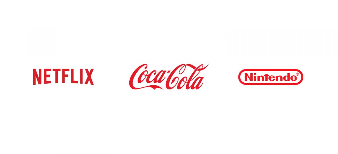
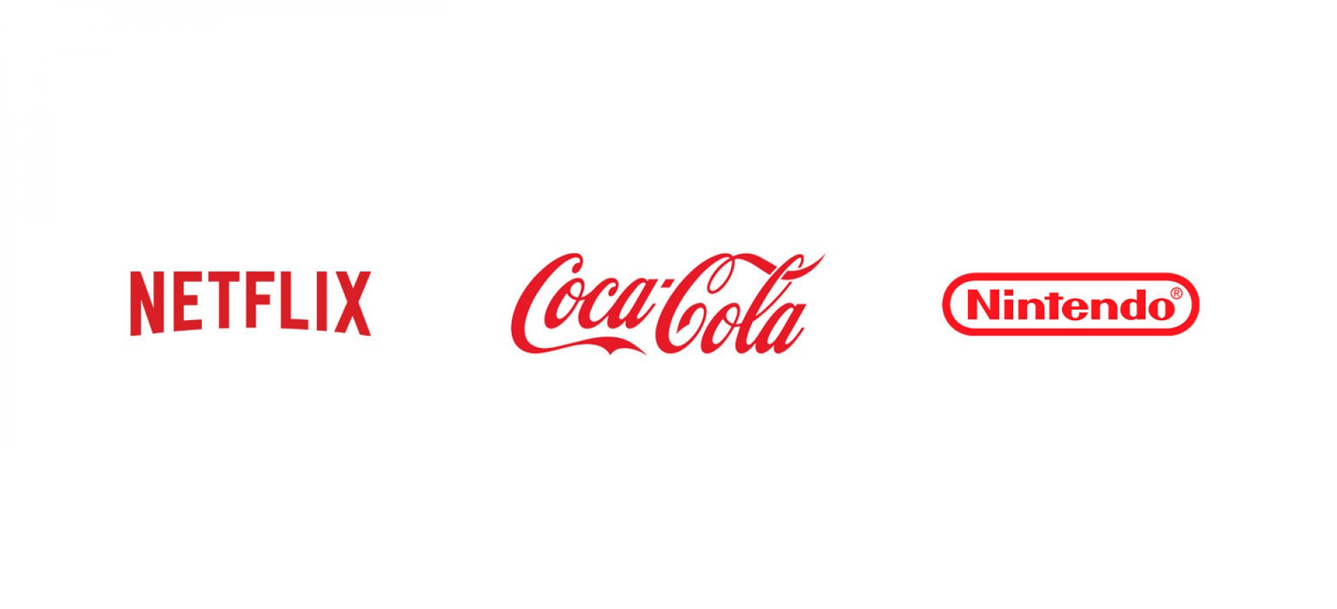
There are huge benefits to understanding how colour psychology can help create a more effective brand. You only need to look at some of the world’s biggest brands to see examples of how powerful colour can be. Below is a list of some of the most used colours, along with some guidelines for each.
Red
Possibly the most dramatic of all colours, so it’s important to use it carefully for branding. Red has been shown to accelerate and intensify reactions — which is why sale prices are often displayed on red labels. It’s the colour of stop signs, grammatical errors, and negative finances. Studies have shown that athletes up against opponents wearing red are more likely to lose, and students tend to perform worse on tests if exposed to red beforehand.
It is the colour of passion and romance. Red tends to increase the appetite and is often used within expressions focussed on excitement: ‘red-hot’, ‘red-handed’, ‘paint the town red’, ‘seeing red’.
Positive: Power, Passion, Energy, Strength, Excitement
Negative: Anger, Danger, Warning, Aggression, Pain
Orange
Orange is stimulatory, conjuring feelings of enthusiasm, and warmth. It often evokes a sense of comfort like food, warmth, and shelter. It is the colour of sunset and citrus and for Western cultures, strongly associated with Autumn and Halloween.
Positive: Courage, Confidence, Warmth, Innovation, Friendly
Negative: Deprivation, Frustration, Frivolity, Immaturity, Sluggishness
Yellow
Yellow is often thought of as a cheerful colour, but too much can trigger feelings of anger, frustration, fear, and anxiety. It’s been shown to increase metabolism and can lift self-esteem when used correctly. It’s the most visible colour, making it stimulating and attention-grabbing, hence we often see it used on traffic and warning signs.
Positive: Optimism, Happiness, Creativity, Intellect, Extravagant
Negative: Irrational, Fear, Caution, Anxiety, Frustration
Green
Green is the easiest colour on our eyes because it requires no adjustment when it reaches the retina. This makes it calming, restful, and pleasing. Performers waiting to go on stage or television wait in ‘green rooms’ to relax. Green can improve our vision and is used within night vision goggles because our eyes can discern the most shades of it.
Sitting comfortably in the middle of the colour spectrum, green is the colour of balance. It represents nature and fertility and conjures visions of a world that is a safe, lush and life-giving. For this reason, it’s often used within the healthcare and environmental sectors. As with all colours, green also has a negative side — it also symbolises sickness and jealousy.
Positive: Health, Hope, Fresh, Nature, Growth
Negative: Boredom, Envy, Fatigue, Sickness

Blue
The colour of the sky, oceans and lakes, blue is the colour of clarity. According to studies, it’s the world’s most common favourite colour (particularly amongst men). This global preference makes blue un-threatening, safe and traditional. Implying stability and reliability, studies have shown that employees are more productive in blue rooms.
On the flip side, blue represents sadness and cold. It’s also among the least appetising of colours and some weight-loss programmes recommend eating food from a blue plate to discourage over-eating.
Positive: Trust, Loyalty, Dependable, Logic, Purity
Negative: Cold, Detached, Emotionless, Unfriendly, Unappetising
In summary
Your visual identity can be a powerful influencer on how people perceive your brand and colour is one of the most important characteristics of a visual identity. Choosing a colour that is authentic to your brand, encapsulates your personality, resonates with your audience and differentiates you from your competition is one of the best ways to create a powerful and meaningful brand identity.
So which colours are right for your brand?


